Axios App

Team: Cyrus Chau (Product Design Lead), Marcus Moretti (Product Manager), Alex Wasner (Tech Lead), Axios dev team
The Big Picture
Axios is a digital media company aiming to deliver news worthy of your time to get you smarter, faster on what matters. Traditionally, news articles are written in the way journalists want to produce, often long-winded pieces that take too long to get to the point. Axios invented a new way to deliver news – Smart Brevity format. Designed to cut through the noise and only cover clinical facts and never pick sides.
How it works
Before this project began, Axios journalists deliver content in several products: Website, Newsletter, Axios on HBO show, and their own social media platforms.

Reality Check
Each way of Axios news consumption has pain points to users or room for UX improvements.
-
Website: On our current site, over 75% of users are browsing from their mobile devices. Lacking in a native reading experience creates friction.
-
Newsletter: Our newsletter subscribers are considered the most loyal user group among all readers. However, out of our 20+ newsletters, users only subscribe to an average of 2-3 newsletters at a time.
-
Axios on HBO: This one is simple – not everyone has HBO (especially since the finale of Game of Thrones). Not even Axios employees can consume the content.
-
Journalists’ social platforms: it’s not ideal for a news organization to have their audience consume news outside of their publication.
What’s next
From the current website users, we learned that there’s a huge opportunity for a mobile-native reading experience to achieve a higher retention rate. And Axios app has always been a popular searching term on Google, so it was time to make one.
But, But, But: There are already thousands of news apps in the App Store, and no one uses them, recommends them and we wanted to learn why.
This is because they basically take a newspaper and turn it into an app (which everyone suggested we do…)

User Research
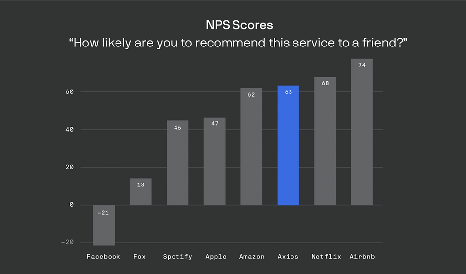
Our thought bubble: What’s better than asking the readers themselves what they look for. And the results were stunning. There’s one key takeaway that outweighs any other findings throughout our research – which is 90% of Axios fans begin their relationship with the organization via one specific reporter. They used journalists’ names more than they use any products’ names, or even Axios’s name. This is a huge factor that drives user satisfaction with our newsletters, as measured by NPS.

UX goals
The success of a product is driven by the love users have to the product itself, and there’s a need to capture it in order to make a good app. Instead of making another newspaper app, we took another approach and set 3 key hypotheses:
1. App as Newsletter 2.0

Users want digests from trusted experts, as well as occasional important updates outside of the newsletter cadence.
User pain points: Our current newsletter subscribers suffering from flooded email inboxes and that refrains users from subscribing to more channels. Also, newsletter routine stops in the morning. News readers often time have to go to other sources (i.e. Twitter, Facebook, Other news apps, etc.) throughout the day to keep up with breaking news, which is a big leak in user retention.
Solution: A concept of Channel was born – a channel for journalists to curate their expert opinions along with factual stories from Axios, without any noise from the outside world especially social media nowadays. Each journalist has their own channel for their own newsletter series, live updates, and related stories. Providing a single platform to consume Axios news, newsletter, and live updates from journalists.
2. People trust people

Users prefer to get news/information from individuals rather than from a corporation or other organization. The personal connection matters.
Solution: Other than newsletter and stories, there’s a need in personal connection with users. The home feed also curates messaging functionality that provides an expert opinion upon factual stories to give users a personal take of important news from their beloved journalists.
3. Sense of completion

Users want a finite feed of deliberately curated content in their areas of interest, not infinite scroll/list of all headlines.
Solutions: Time is precious, and we don’t want to waste yours. Traditionally, newsletters are lengthy due to the limitation in the email format. Each story is collapsed into an Atomic Unit format – a summarized version of a story that designed to fit nicely in a device viewport, with a “Go deeper” button to expand the story if users wish to learn more. As a result, our newsletter gets 50% shorter in-app.
Bonus: Dark Mode

Users overwhelmingly requested dark mode in our user testing program. We listened, and delivered:)
Conclusion

We held a Beta program for users to test the app out 2 months in advance to make sure our product ideas are validated and made some quick adjustments to make sure users voices are heard. When the app was launched, we are pleased to see users were highly satisfied with the product and the reviews greatly captured our UX goals.